
We’ve got a small team here that’s feverishly working on ramping up our reporting module ASAP. While we already have email reporting, alerts, events, etc, and a server dashboard that tells you about current backups, licensing, storage utilization, etc- we’re working on one key bit: a single screen that lets you look out for the ‘reds’ and take appropriate action!
I just had a look at the initial designs for this ‘work in progress screen’, and we’re about to decide on one of two. We’ve never been fans of long meetings and most of our decisions are fairly ‘obvious’ or are driven by our customers. So we thought we’d get the ‘wisdom of the crowds’ on this one too…
Which of these designs works better for you ( I won’t get into the details of each); just give us your ‘blink‘ reaction.
Important: These are in no way, finished screens – they’re more like ‘initial drafts’ ; however, they (hopefully) convey the broad ‘idea’…
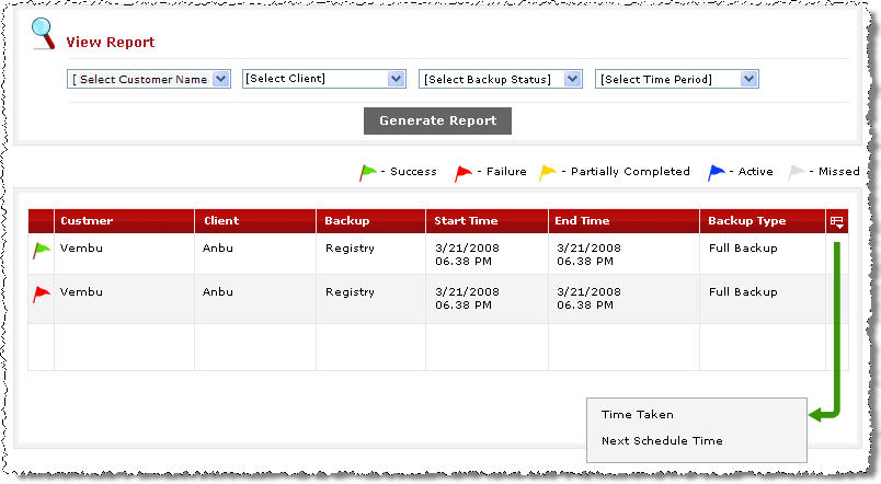
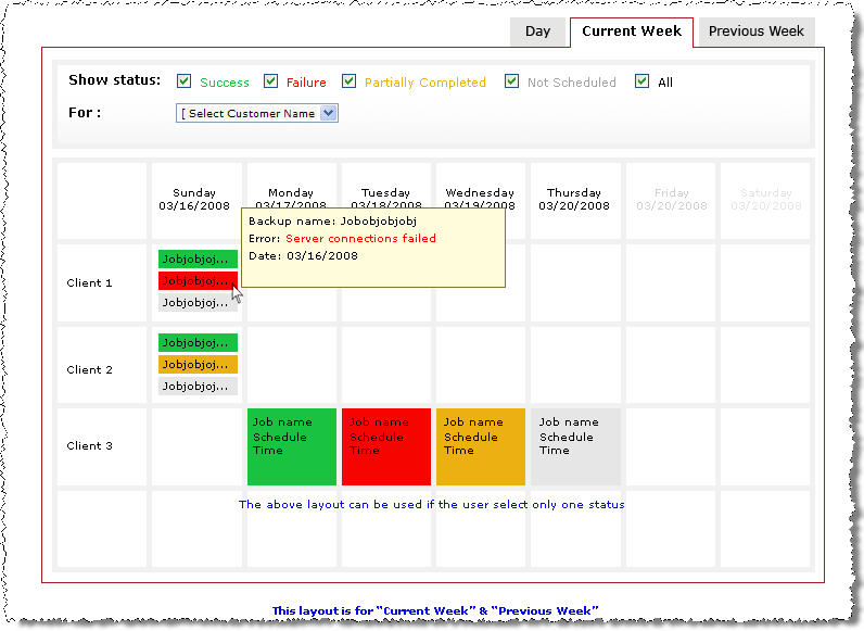
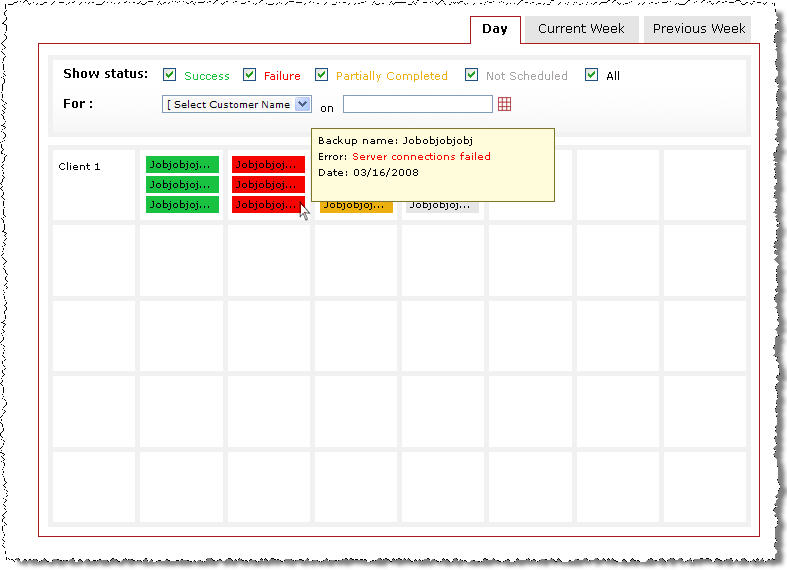
Option 1: The Calendar Option

Screenshot a (for option 1) – in Week view
Screenshot b (again, for option 1) – in Day view
Let me also toss in my 0.02 – I’m with Option 1!
Let us know your view ASAP in the comments.

I like option 1.
Hi
I like option 2.
Can we have an option to choose daily, weekly or monthly?
Once this is done, it will be a good package and will help me out alot.
Thanks
James
I would go for option 2. It is easier to see the status of backups at a glance that way. I agree with James on the Daily, Weekly and Monthly displays.
Option 2, because it gives you more data at one glance.
However, you should include both because there are advantages to each view.
Yea I think option one looks more “refined” but the information and layout of option 2 is definitely the way to go.
with one glance you get a better understanding of whats going on hands down. especially because you have the day and weekly views.
The one thing i really like about the whole program is the use of gaining information through mouse overs. I’ve never used a piece of software that makes such extensive use of mouse over’s to give the user information and its actually really good!!
Option 2!!!!!!
I like option 2. It looks like you get more information at a quick glance.
Option 2.
Colors are nice and easy on my tired eyes.